
Door Rik Van Schaik op 12 Oct, 2019
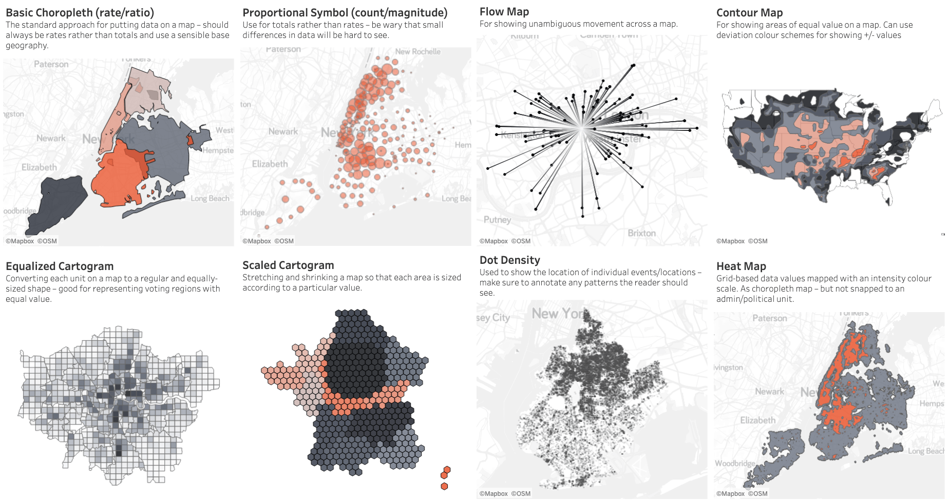
There are so many ways to visualise data – how do we know which one to pick? Zen Master and head of The Dataschool, Andy Kriebel, is always there to help you. He created a Tableau dashboard where you can select a category to decide which data relationship is most important in your story, then look at the different types of charts within the category to form some initial ideas about what might work best. The list is not meant to be exhaustive, nor a wizard, but is a useful starting point for making informative and meaningful data visualisations. Check out the viz below or click here for better view.

Delen
Vorige blog
← Use parameters as highlighter
Row Level Calculations vs. Aggregate Calculations

Row Level Calculations vs. Aggregate Calculations
8 Jan, 2020
2
min
Datagedreven werken: hoe maak je de juiste keuzes vooraf?
![]()
Datagedreven werken: hoe maak je de juiste keuzes vooraf?
29 Feb, 2024
3
min
Connectie maken met Tableau Sample - Superstore
Connectie maken met Tableau Sample - Superstore
20 Jul, 2020
1
min


