Door Daan Verkerk op 31 Mar, 2023
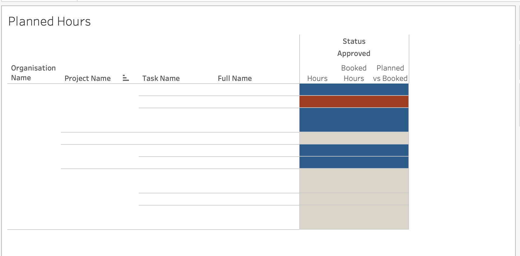
Tableau is a powerful data visualization tool that can help you create insights quickly and easily. While it can be daunting to start with Tableau, especially when looking at Tableau Public with its many great visualizations, you can create great insights without making it pretty.
I have colleagues who created amazing and beautiful dashboards. For instance an escape room based on Casa de Papel or a viz on Spotify listening behavior with the look-and-feel of Spotify. How can I ‘compete’ with that?
But you don’t need to create a perfect dashboard to gain valuable insights.
Recently, a colleague needed information for the planning of his project. I used Tableau to quickly create a visualization that gave him part of the needed insight. Not a great viz, but a useful one none te less. This saved him valuable time instantly, and will serve as the basis for a more complete dashboard.

As you can see, this is not an amazingly beautiful visualisation, but useful despite the looks.
Overall, Tableau is a great tool for creating insights quickly, even if you’re just starting out. Its intuitive interface and powerful features make it easy to work with and allow you to gain valuable insights that can help you make better decisions. And remember to not be scared to start or create something ugly yet useful.

Tableau File types: an introduction
Data-driven alerts for Tableau Server | New feature in Tableau 10.3